[listening to "welcome to new york" by taylor swift]
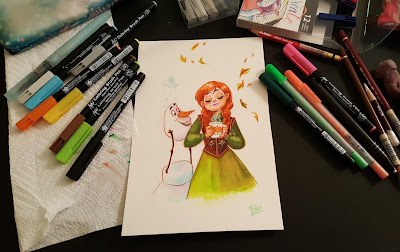
happy fall, guys! i decided to crack open my brand new Koi Coloring Brush Pens from Sakura the other day and try it on this fall-inspired doodle of Anna and Olaf. i know Anna has a winter look, a spring look (courtesy of the Spring Fever short), and probably even a summer look if the outfit she had on at the end of the movie counts. so i wanted to put her in typical Autumn greens and oranges and browns. and i gave her a mug of pumpkin spice latte, if they have that sorta stuff in Arendelle.
(which, i'm gonna say they do because it's not a real place. so whatevs.) i think she'd love some PSL, and Olaf will probably wanna get in on that action.
i wanted to use the Koi pens exclusively so i didn't use any copics or watercolors mixed with it. i used my colored pencils for the lines and steam (from the cup), a black ink pen just for eyes/eyebrows, and the Gelly Roll pens (from Sakura also) for the tiny details in her dress. i was limited to the 12 colors that came in the pack but i did also have a pack of grays (3 cool grays, 3 warm grays) so those helped a bit with some color blending. but what really did the trick for me was to use my watercolor brush pen
(the blue brush pen where u can put water in the chamber) to help blend all the colors together nicely. without it, i think each color is just way too saturated. sometimes, especially in Olaf's case, i dabbed the brush pen right on the Koi pen tip so it can be super light.
with that in mind, i wouldn't recommend this to beginners because of the limited number of colors and how saturated each color is.
but having said that, it IS pretty cool to try out with a brush and some water. it's almost like the effect of watercolors without all the mess. i also used some textured watercolor paper (i believe it's cold-press paper) so that'll go a long way to making them blend properly, i think. i'm not sure what it would look like on a more smoother paper like Bristol or something. if you're looking to experiment with a different set of markers, i highly recommend playing with these and seeing if they're a good fit for what you're looking to do.
all in all, i wish i had more colors! a couple more flesh tones would help a lot, plus maybe like 1 additional shade of each basic color. if i had a pretty good set of these, there's a chance i would give up my Copic markers for them at comic cons. i mean, i still love my copics, don't get me wrong. but there's so many that i need and it gets a bit cumbersome to bring them to cons all the time. they blend really nicely together but i can't fuzz the edges with water cuz they're markers. once they're on the paper, that's it.
(still, Copics are much better than Prismacolor markers in my opinion.) oh, and let's not forget the fact that they're pretty pricey. i mean, they're pricey for good reason, they're definitely better than other markers i've ever used. but sometimes, i feel like all i'm doing is buying more refills and spending more on other colors. one really good comic convention will kill my markers because of the number of commissions i do.
i'm gonna keep playing with these pens. especially since INKTOBER is coming up, i may dabble with the grays a lot more.


